
QUIET EXPRESSION
Benjamin Moore 2022 - Colour of the Year
What does the world need now more than a feeling of tranquility at the beginning of a new year? Benjamin Moore answers with its Colour of the Year.
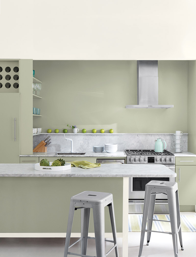
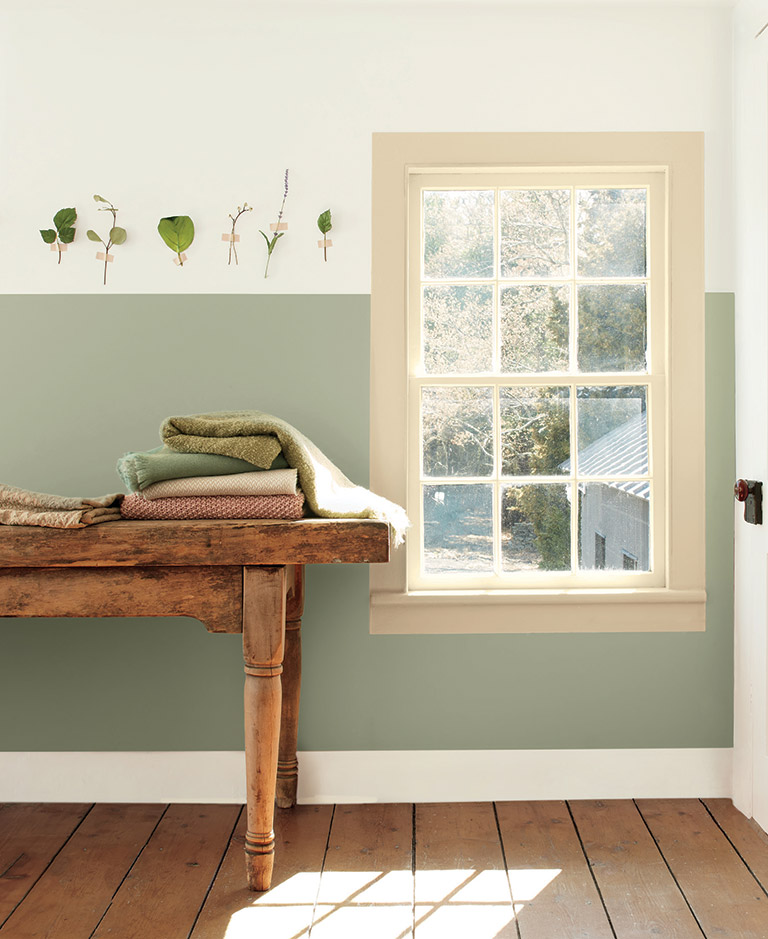
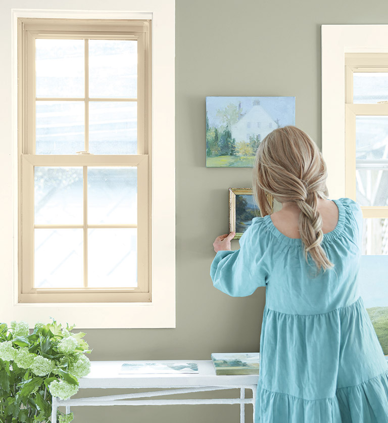
October Mist is versatile enough to be used as an accent or as the main colour of a room. It can be paired with other colours in a variety of ways, with softer hues on woodwork and trim or with darker tones on furnishings for a pop of colour.
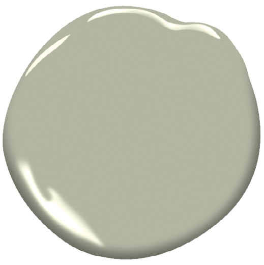
October Mist is a soft sage green Benjamin Moore colour specialists believe can create a canvas for the rest of the 2022 colour palette and for clients’ imaginations. “October Mist and the corresponding Colour Trends 2022 palette reflect an effortless harmony of colours, while inspiring unique combinations for any paint project,” says Andrea Magno, director of colour marketing and development.
“The palette is very natural looking,” says Leisa Bertelsen, general manager for Clancy’s Rainbow paint stores in London. “People are looking for neutral colours. They want something calming in their homes.” “The colours are soft, comforting and easy to live with,” agrees Cathy Cloes, owner at Hyde Park Paint and Paper. “It’s exactly what people are searching for right now.”
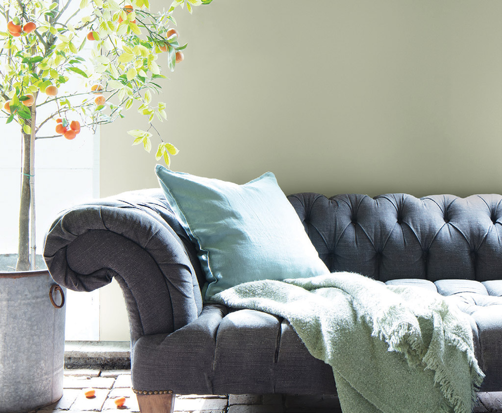
The 14-colour collection runs the gamut from Gloucester Sage, a dark grey with a green undertone; Mysterious, a rich denim/navy blue; and Wild Flower, a deep red dusted with hints of pink and orange, to a soft white called Steam, the sandy Natural Linen and Collector’s Item, a pink-tinged off-white.
“We wanted to create a palette that was flexible and encouraged consumers to play and experiment with paint colors,” says Benjamin Moore colour marketing and development specialist Arianna Cesa. “Our homes can be the ultimate form of self-expression. We curated our Colour Trends 2022 palette with that in mind.” Cesa says October Mist is a bridge colour with opportunities to be paired with other colours in “endless” ways.
Benjamin Moore's Colour Trends 2022 collection offers both warm and cool options. Though it is primarily made up of pale shades, the darkest of them offers a sharp contrast for decorators.
For example, she suggests pairing it with soft white Steam for trim and interior doors or turning up the contrast for a bolder combination, using the dark blue Mysterious or grey-green Gloucester Sage. Those darker colours, she adds, can look amazing on kitchen cabinets with Steam white walls balanced by October Mist in an adjoining room.
She says October Mist can stand out as a focal point as an accent wall when it is combined with Morning Dew, a soothing cool grey with a touch of green, on adjacent walls. Or for a more playful pairing, clients might consider Hint of Violet, which she describes as “a frothy lilac with a cool grey cast.”
Bertelsen agrees that October Mist is versatile enough to be used as an accent or a whole room colour. “It’s a type of green that’s neutral enough to be used in a larger area.” She predicts it may promote dusty rosy pinks coming back into play.
Cloes agrees the colour of the year can provide a neutral background for use in multiple rooms. “It works well with the historic collection and in older as well as newer homes.”
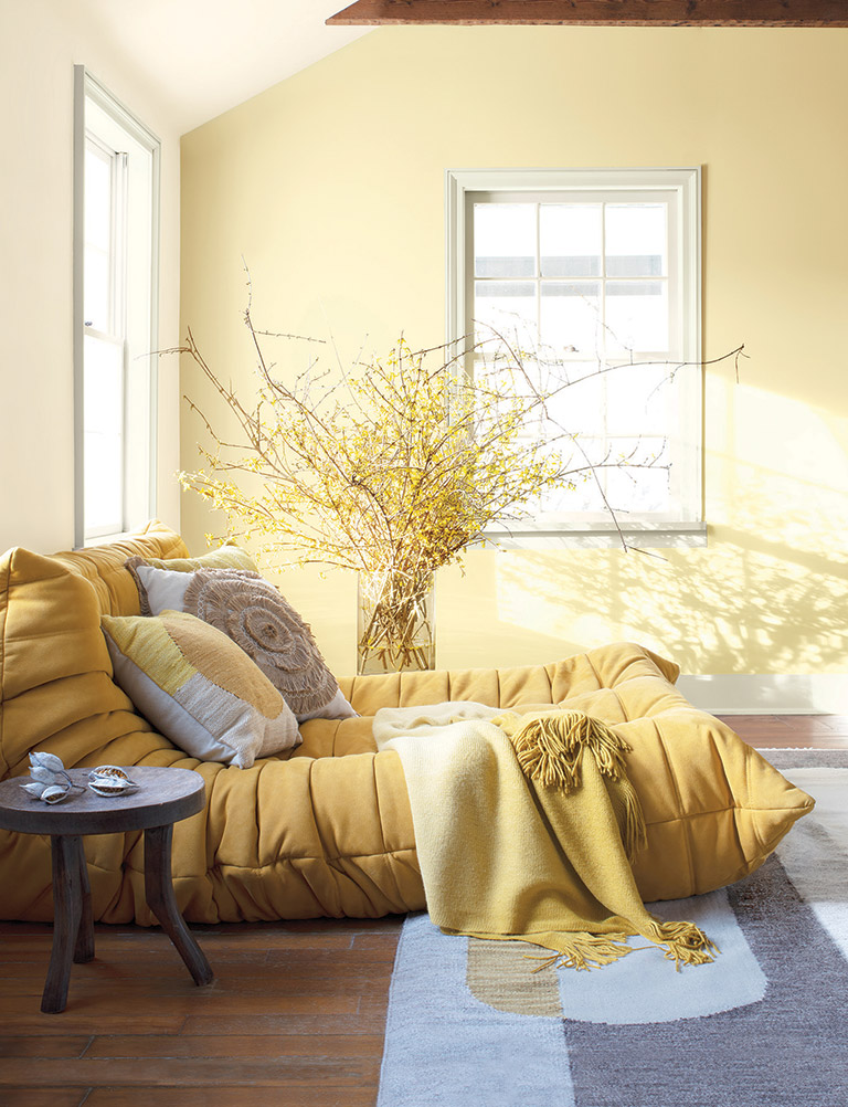
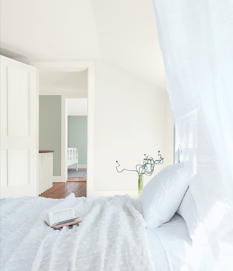
She says the range of colours will “integrate beautifully with the warm greys that have been so popular lately and make it easy for our clients to make subtle updates to their décor.” Cloes suggests Pale Moon, a pleasing soft yellow that is uplifting but not overwhelming, and Quiet Moments – a mix of blue, green and grey – are attractive options for baths or bedrooms.
Both Cloes and Bertelsen say customer reaction to the new colour of the year and its accompanying palette is positive.
“We were excited to see the green,” Bertelsen says. “I thought it might have been a grey, but they brought a little more pop of colour, yet still calm and subdued, nothing loud.”
Bright colours, she says, are initially eye-catching but often not what clients want to put on their walls. They are more likely to choose those colours for less permanent accessories such as bed pillows or sofa cushions.
October Mist has enough green and enough grey to appeal to the neutral trend, Bertelsen notes. “People are attracted to green tones.”
That played into Benjamin Moore’s ultimate decision, Cesa says. “Green exudes balance and stability, but also pairs perfectly with a variety of colors, enabling personalization. October Mist had that right combination of presence and subtlety to form the cornerstone of the palette.”
“I think it will be popular and people will use it a lot,” Bertelsen says.
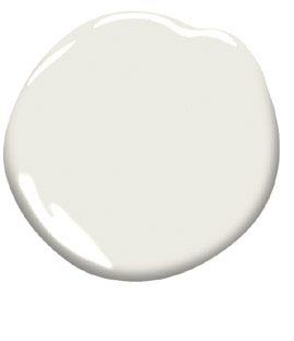
Steam AF-15
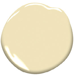
Pale Moon 298
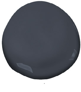
Mysterious AF-565
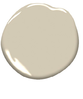
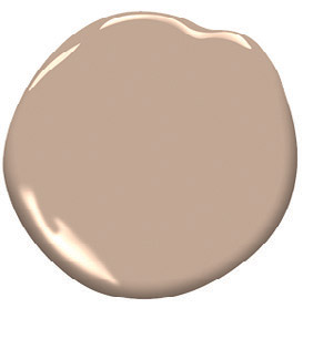
Natural Linen 966
Venetian Protico AF-185
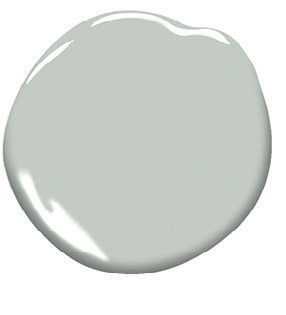
Quiet Moments 1563